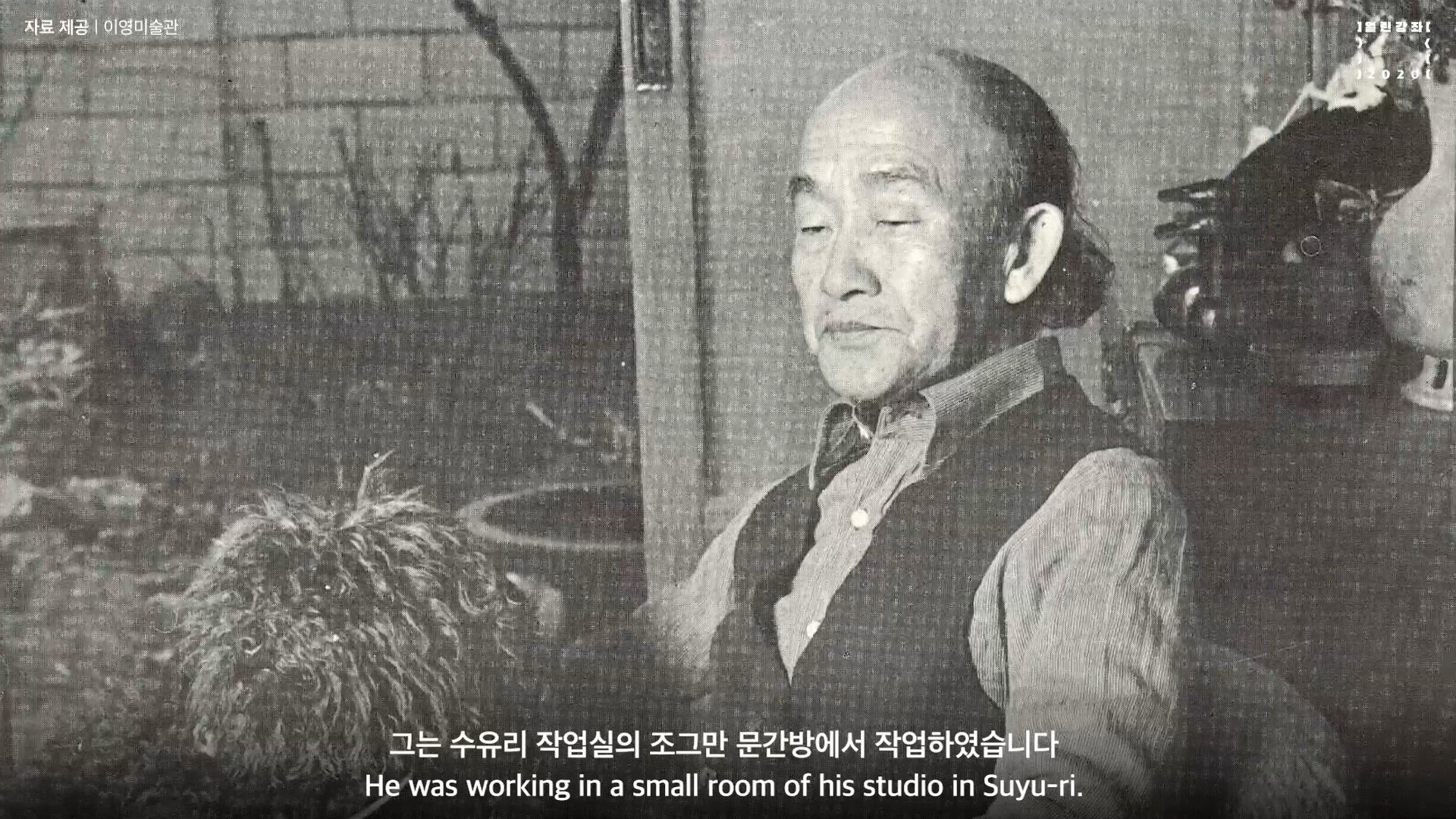
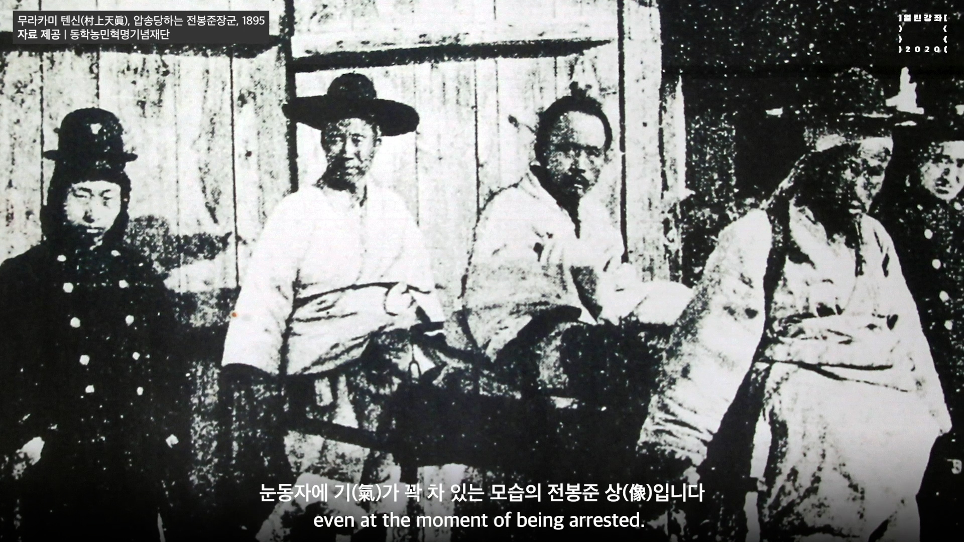
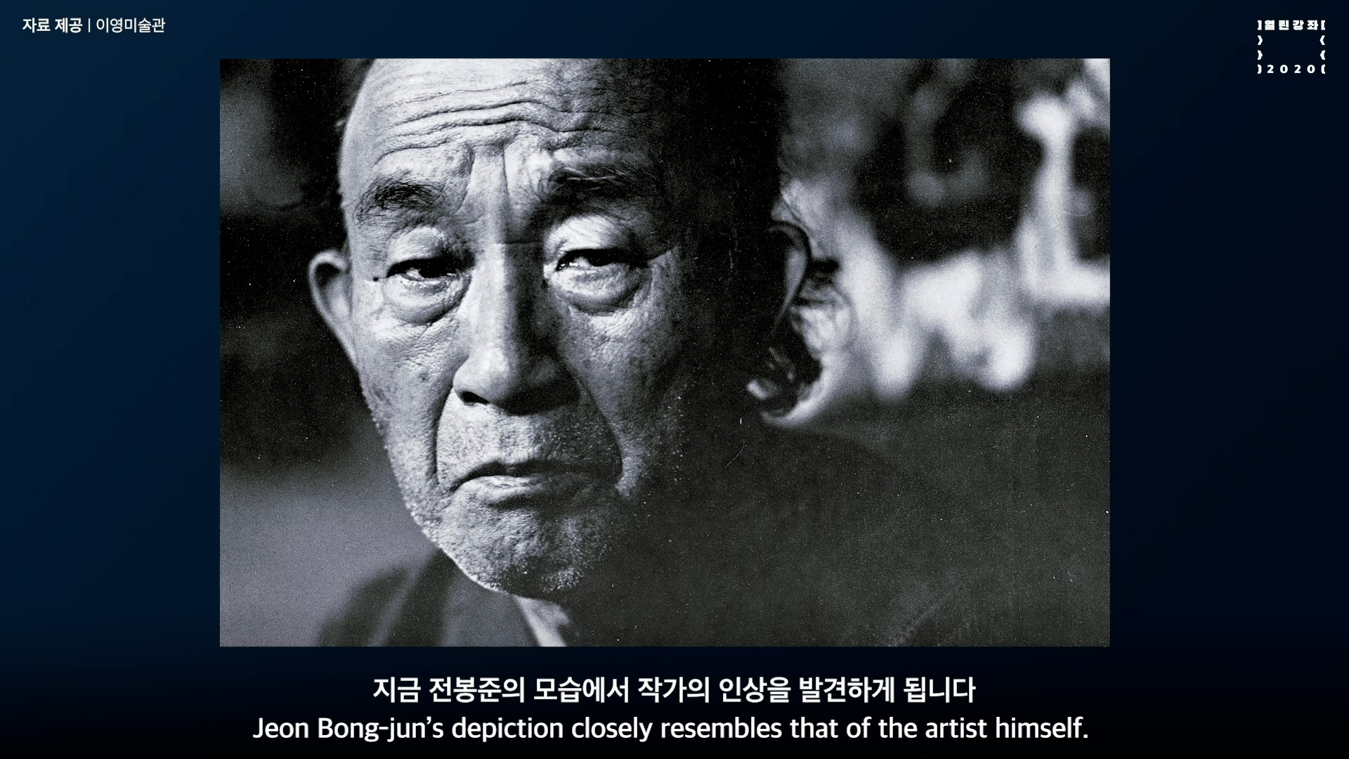
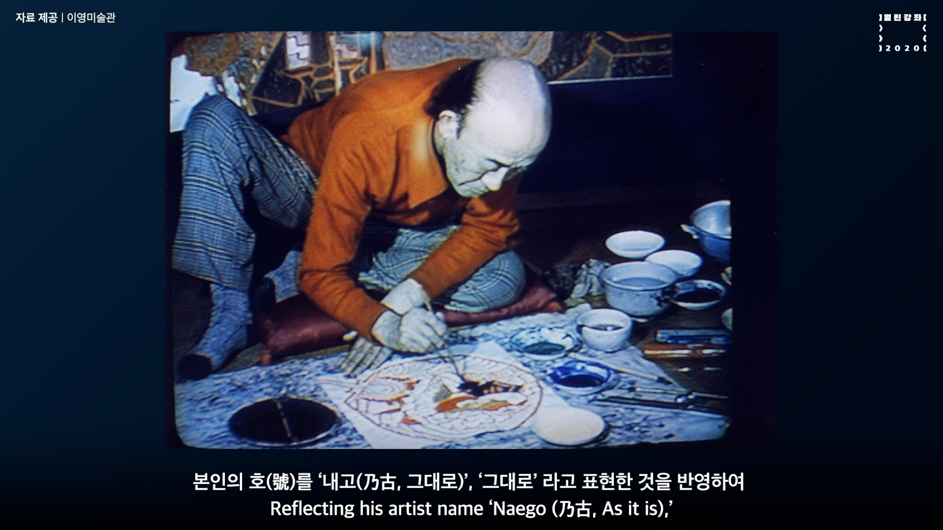
국립현대미술관 MMCA
미술관소장품강좌 (박생광 Park Saengkwang, 전봉준 Jeon Bing-jun, 1985)
2020
Client 국립현대미술관 MMCA
Project 미술관소장품강좌 (박생광 Park Saengkwang, 전봉준 Jeon Bing-jun, 1985)

국립현대미술관
열린강좌
미술관소장품강좌
2020

National Museum of Modern and Contemporary Art, Korea
Open Class
MMCA Collection
2020

크레딧 보기

제작: 국립현대미술관
기획: 강지영
영상: 57STUDIO

작업 소개

57STUDIO는 국립현대미술관의 열린강좌 프로그램 중 미술관 소장품 강좌 시리즈를 제작하였습니다. 윤범모 관장이 직접 작품을 설명하는 형식으로 구성하였으며, 실제 교육 현장에서 효과적인 학습 자료로 활용될 수 있도록 제작되었습니다. 또한, 어느 장면을 캡처하더라도 교육 자료로서의 기능이 충실히 전달될 수 있도록 화면을 구성하였습니다. 이 시리즈는 작가 12명의 작품을 조명하며, 매주 수요일 YouTube LIVE를 통해 공개되었습니다.

57STUDIO produced the Museum Collection Lecture Series as part of the National Museum of Modern and Contemporary Art’s (MMCA) open lecture program. The series was structured in a format where Director Yoon Bum-mo personally explains each artwork, ensuring its effectiveness as a valuable educational resource for use in learning environments.

The videos were designed so that every frame could function as an informative material, regardless of where it was captured. This series highlights the works of 12 artists and was released weekly via YouTube LIVE every Wednesday.

박생광 <전봉준>, 1985

오늘 말씀드릴 소장품은 박생광 작가의 대표작이자 말년작, <전봉준>이란 제목의 작품입니다. 박생광 화백은 여타의 화가들과 달리 특이한 경력을 갖고 있는데 70대에 이르러 화풍을 대폭적으로 바꾸었다는 점입니다. 대개 원로 화가들은 7-80대에 평생 작업한 내용을 마무리하는 특징을 보이는데 박생광 화가의 경우 70대에 청년 작가와 같은 새로운 도전을 했다는 점이 큰 특징입니다.

내용적으로는 <전봉준> 작품에서 보시는 것처럼 오방색을 비롯한 원색을 활용한 점, 원색 중에서도 진채(眞彩), 즉 농채(濃彩)를 사용한 점이 특징입니다. 단색화가 유행했듯 70년대만 하더라도 색채를 크게 주목하지 않았는데 박생광 작가는 아주 예외적인 경우입니다. 주제적으로는 우리 민족의 역사를 기본으로 단청, 민화, 불화, 무화, 무속화와 같은 전통을 바탕으로 민족 회화의 새로운 길을 보여주었습니다.

대작인데요. 1985년 작가가 이승을 떠나기 전 제작한 말년의 작품으로 제가 이 시기에 작가의 화실을 여러 번 방문한 경험이 있습니다. 작가 회고전을 준비하기 위해 자주 만나 뵈었는데 그는 수유리 작업실의 조그만 문간방에서 작업하였습니다. 작품의 규격을 보면 상당히 큰 작업실에서 제작한 것처럼 느껴지지만 사실은 조그만 문간방에서 작업하며, 작품을 한 번에 모두 펼쳐 작업할 수 없어 종이를 말아 가면서, 한 쪽은 펼치고 한 쪽은 말면서 제작한 작품입니다.이러한 말년의 대작들은 박생광 작가 자신도 전시장에 나와서야 처음으로 한 눈에 작품을 볼 수 있었는데 그만큼 옹색한 공간에서도 민족 회화의 대표 작품을 만들었음을 알 수 있습니다. 특히, 작가는 말년에 한국 근대 역사에 집중적으로 관심을 가졌고 <명성황후>(1984)와 같은 대표 작품을 만들기도 했습니다. 그리고 <전봉준>을 주제로 한 작품 외에도 근대 사회의 역사적 장면을 담은 대작을 준비하던 중 이승을 떠나셨습니다.

작품을 살펴보면, 주인공 전봉준 장군의 초상이 화면의 중앙을 차지하고 있습니다. 우리가 사진에서 많이 보았듯, 압송하는 장면에서 눈동자에 기(氣)가 꽉 차 있는 모습의 전봉준 상(像)입니다. 그의 주변으로 관군들이 보이고 경악하는 표정의 농민들이 주변에 있습니다. 농민들의 모습은 흰 옷, 평복으로 보여주고 주변은 원색을 사용하여 계급의 차이, 신분의 차이를 표현하고 있습니다. 사실 박생광 작가 자신도 저런 모습입니다. 말년에 후두암이 걸려 턱에 커다란 풍선과 같은 혹이 있었는데 지금 전봉준의 모습에서 작가의 인상을 발견하게 됩니다. 아주 간단하게 전봉준 초상을 묘사했지만 기(氣)가 충천(衝天)하는 모습으로 읽혀집니다. 주변에 있는 여러 군상과 주인공인 전봉준과의 표정이나 기(氣)가 완전히 차이 나도록 표현한 요소는 작품의 특징이기도 합니다.

부분적인 요소들을 살펴보면 닭, 소와 같은 요소들을 배치하여 화면을 가득 채우고 있습니다. 화풍상의 특징으로는, 먼저 원근법이 없습니다. 작품의 선을 살펴보면 윤곽선을 강조하고 가운데를 메꾸는 방식을 사용했는데 이것은 백묘법(白描法) 입니다. 단순하면서도 표현하는 대상의 성격이 강하게 드러나는 것이 특징입니다. 좋은 작품은 강약이 있어 주(主)와 종(從)으로 변화를 주는데 이 작품을 보면 그런 요소가 잘 이루어져 있습니다. 화면 경영에 무르녹은 작가의 역량이 담겨져 있다는 뜻입니다.

주인공인 전봉준을 화면의 중앙에 비중있게 처리했고 마찬가지 시각으로 농민, 오열하는 농민을 비중있게 처리했습니다. 반면 관군을 보면 작게 처리한 것을 발견할 수 있습니다. 우리는 이러한 강약 대비, 대소 대비를 통해 작가가 ‘전봉준’이라는 주제의 작품에서 무슨 이야기를 하고자 했는지, 그 주제 의식을 읽어낼 수 있습니다. 전체적인 제작 의도가 작품의 구석구석, 부분 부분에 스며 있다는 점, 이러한 점을 찾아내는 것도 그림 보는 맛이 되겠지요.

화면의 윗부분에 “湖南第一成(호남제일성)” 이라고 하는 전라북도 지역에서의 역사 현장을 공개했듯이 전봉준과 호남제일성, 관군과 농군, 이러한 전체적인 비교를 화면에서 읽게 해줍니다. 그래서 독화(讀畵), 읽을 독(讀), 그림 화(畵), 책을 읽듯이 그림을 읽는 독화의 맛을 보여주고 있습니다. 박생광 작가는 70대 이전까지 주로 일본을 왕래하며 작업을 해왔는데 어떻게 70대에 이러한 형식으로 <명성황후>(1984), <전봉준>(1985)과 같은 작품을 제작할 수 있었을까 하는 점을 생각하게 합니다.

70년대 중반 이후 박생광은 새로운 화풍을 시도합니다. 본인의 호(號)를 ‘내고(乃古, 그대로)’, ‘그대로’ 라고 표현한 것을 반영하여 이를 ‘그대로’ 화풍, ‘내고(乃古)’ 화풍이라고 특화시킬 수 있는데 내고(乃古) 화풍의 결정판이 바로 이 작품 <전봉준>입니다. 작가가 3년, 5년만 더 생존 했다면 이러한 <전봉준> 시리즈가 여러 점 나왔을 텐데 본격적으로 시도하는 중 세상을 떠나게 되어 참으로 안타깝습니다. 20세기 한국 회화사 마지막 부분에 박생광과 같은 작가가 있다는 점은 우리를 행복하게 합니다. 조그만 골방에서 작품을 말아가면서 제작한 작품 <전봉준>, 이 대작이 주는 울림. 그것이 오늘날 우리 관객으로 하여금 감동과 많은 생각을 하게 합니다.

Park Saengkwang, Jeon Bong-jun, 1985

Today, I’m going to talk to you about Jeon Bong-jun,
representative work by Park Saengkwang painted in his late period. Compared to other painters, Park has a unique career trajectory. In his 70s, Park changed his painting style dramatically. Most painters have limited innovation at the end of their lives, in their 70s and 80s. However, exceptionally, Park ventured on a new challenge in his 70s, as if he was a young artist.

The work is characterized by the use of primary colors, including five cardinal colors, particularly Jin-chae (眞彩), which means deep-colored pigments, also called Nong-chae (濃彩). As can be seen in the popularity of Dansaekhwa (Korean monochrome painting), even in the 1970s, very few artists focused on color. So Park was quite unique in this regard. The subject comes from the history of the Korean people and their traditions, including Dancheong (traditional multicolored paintwork), folk painting, Buddhist painting, and shamanic painting. His work suggested a novel way forward for Korean art.

As is evident, this is a huge piece. Park produced this painting in 1985, a year before his death. During this time period, I visited his studio several times to prepare for Park’s retrospective exhibition. He was working in a small room of his studio in Suyu-ri. The size of the work implies a reasonably large studio for its production. However, in fact, he worked in a tiny room by the door of his studio. Because it was impossible to unfold the work all at once, Park rolled the paper up and proceeded to work on individual portions spread out one at a time. Even Park himself could only see the full scope of his large pieces from his late period in the exhibition gallery for the first time. We can see that Park produced his representative works depicting Korean people even in these challenging surroundings. In particular, Park focused on modern Korean history in his late period and produced his essential works, including Empress Myeongseong (1984). He passed away while preparing another masterpiece that presents a historical scene of modern Korean society in addition to the works on Jeon Bong-jun.

Let’s look at the work. As we can see, the portrait of the protagonist General Jeon Bong-jun occupies the center of the painting. His eyes are filled with the same kind of energy evident in photographs of him, even at the moment of being arrested. There are government forces around him, as well as farmers with shocked expressions. The farmers are wearing plain white clothes while primary colors are used for the surroundings, showing the difference in social class and identity.

In fact, Park himself looked like this. In his late period, he had laryngeal cancer that caused a big balloon-like lump on his chin. Jeon Bong-jun’s depiction closely resembles that of the artist himself. The painter depicted Jeon Bong-jun in a simplified form, but does not negate the intensity and energy of the figure. It is impressive that the level of energy felt in the surrounding groups is entirely different from that of the main character, Jeon Bong-jun.

Regarding the details, we can see motifs, such as a rooster and a cow, that fill the painting. Technically, there is no law of perspective operating in the painting. Lines are used to emphasize the contour, and the inner space is filled in color. This technique is called the Baekmyobeop (白描法). It is characterized by robust and straightforward expression of the object’s features. A great artwork has dynamics in it, and the artist expresses the main and the subordinate elements, creating an artistic rhythm. This work is an excellent example of that. It means that the work reflects the artist’s mature compositional capacity.

Park highlights the protagonist Jeon Bong-jun by depicting him in the center. Also, at the same time, he emphasized the crying farmers. On the other hand, he painted the government army in a smaller size. Such difference of emphasis and size leads us to read the subject matter of the work and what the artist meant to express in his Jeon Bong-jun painting.

It is also interesting to find how the overall theme is permeated in every corner and detail of the work. The artist reveals the historical site as the Jeollabuk-do region by writing “The Principal City of Honam, Jeonju (湖南第一成)” in the upper part of the painting. Viewers can also read the story and the way Jeon Bong-jun, the principal city of Honam, the government army, and the peasant army are expressed. Therefore, this work lets us appreciate the zest and possibility of ‘reading paintings,’ which means understanding a painting like a book.

Before the age of 70, Park used to work traveling to Japan. It is incredible how he could produce works like Empress Myeongseong (1984) and Jeon Bong-jun (1985) in his 70s.

Since the mid-1970s, Park attempted a new style of painting. Reflecting his artist name ‘Naego (乃古, As it is),’ we can categorize this style as ‘Naego painting style.’ The definitive work of this approach is this work, Jeon Bong-jun. If Park survived for only three or five more years, there would have been several series of Jeon Bong-jun. It is a pity that he died while trying it in earnest.

It makes us happy to have an artist like Park Saenggwang at the end of the 20th-century history of Korean painting. Jeon Bong-jun was made possible by this unyielding artist who worked while rolling up the large paper in a tiny room. It leads us to contemplate art, and we, as viewers, are moved by it.